Project Brief
What are the Challenges?
How might we provide Netflix subscribers a better user experience in sequentially organizing their bookmarks while increasing user retention?
So here’s the problem…
Netflix subscribers need a better user experience in organizing preferred media content because they get overwhelmed by the amount of TV shows and movies bookmarked into their My List collection.
My Role
As a solo independent UX/UI Designer, I have conceptualized a redesign for the iOS Netflix app. Using lean UX principles, I have conducted research, created wireframes and prototypes, and led both Visual and Interface Design.
Disclaimer: Not affiliated with the Netflix company.
Understanding the Problem
Empathize

Netflix has been one of the leading streaming services world wide for over a decade with movie and television show content multiplying by the second. Through time, the platform has accumulated thousands of movies and television shows. I wanted to take the initiative to conceptualize a way for subscribers to organize their desired streaming content with minimal user effort on their iOS devices.
What we learned
Define

My research began with interviewing 5 different Netflix users from the age range of 18-32. As a result, discovered the following problems users face involving the app on platform and off.
Many users have been Netflix subscribers for over 5 years .
The clutter of video content on My List discourages users to watch shows recommended by friends.
There isn’t a feature to like or keep track of specific TV series episodes or seasons.
The more the video content, the more effort to scroll.
No ability to organize My List.
Users primarily use the My List section to bookmark seasons of TV shows they’ve enjoyed.

Putting everything together
Ideation
The biggest common pain points were that their My List triggers a snowball effect of endless media, and that the visual designs appeared outdated. However, users already have a solid familiarity with the current UI. In my iteration, I strived to redesign the app for iOS that would give users the ability to be in control of how they organize and keep track of all the television shows and movies they love and hope to watch.

Prototype + Testing
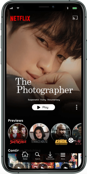
Home
Users will be given a new navigation bar interface to easily select the Home page, Search for their desired content, including their Downloads. An access point to the users Account Settings had also been added to the bar.
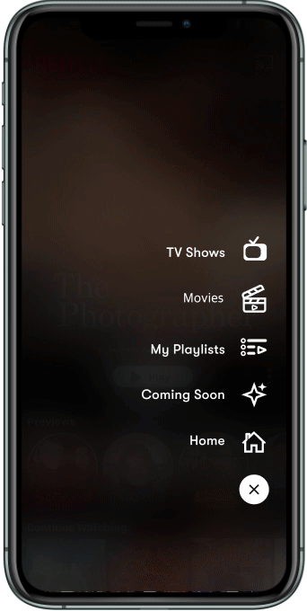
The Content Type selection dropdown menu was redesigned into a sub-menu option to the top right of the navigation bar, where the Coming Soon section had been moved to.

Playlist: Painpoint Extermination
This is the main hub where subscribers can find their collection of playlists. My Likes section has been moved to the My Playlist section.
To prevent Netflix subscribers from being overwhelmed by the number of compilations, they have the ability to organize their collections by pressing down on a playlist and rearrange them in any order of their preference.

Creating a playlist
Users feel more at ease with breaking down clusters of content into different collections, as opposed to being dependent on one bookmark list.
While staying true to the current usability, locating these newly added steps are a breeze for both old and new users! One way a user can create a playlist is through the My Playlists page, or through the media content’s info page.
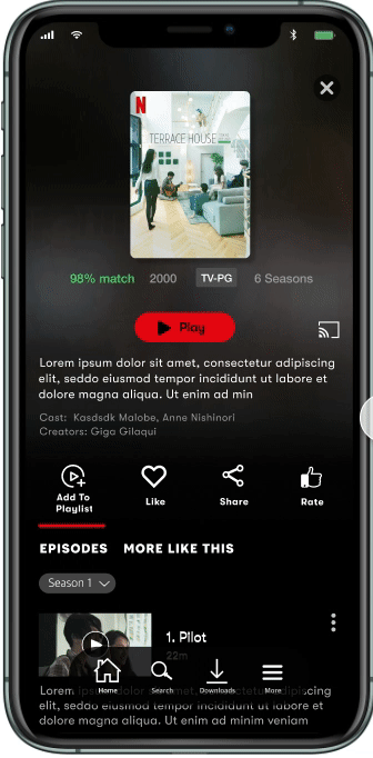
Add a portion or Add it All
The info page for a series or movie has been redesigned. While they still have the ability to bookmark, share, and rate the media content, users can now:
Add an individual episode to a playlist
Add the whole season to a playlist.
Create a playlist with the content you’re viewing
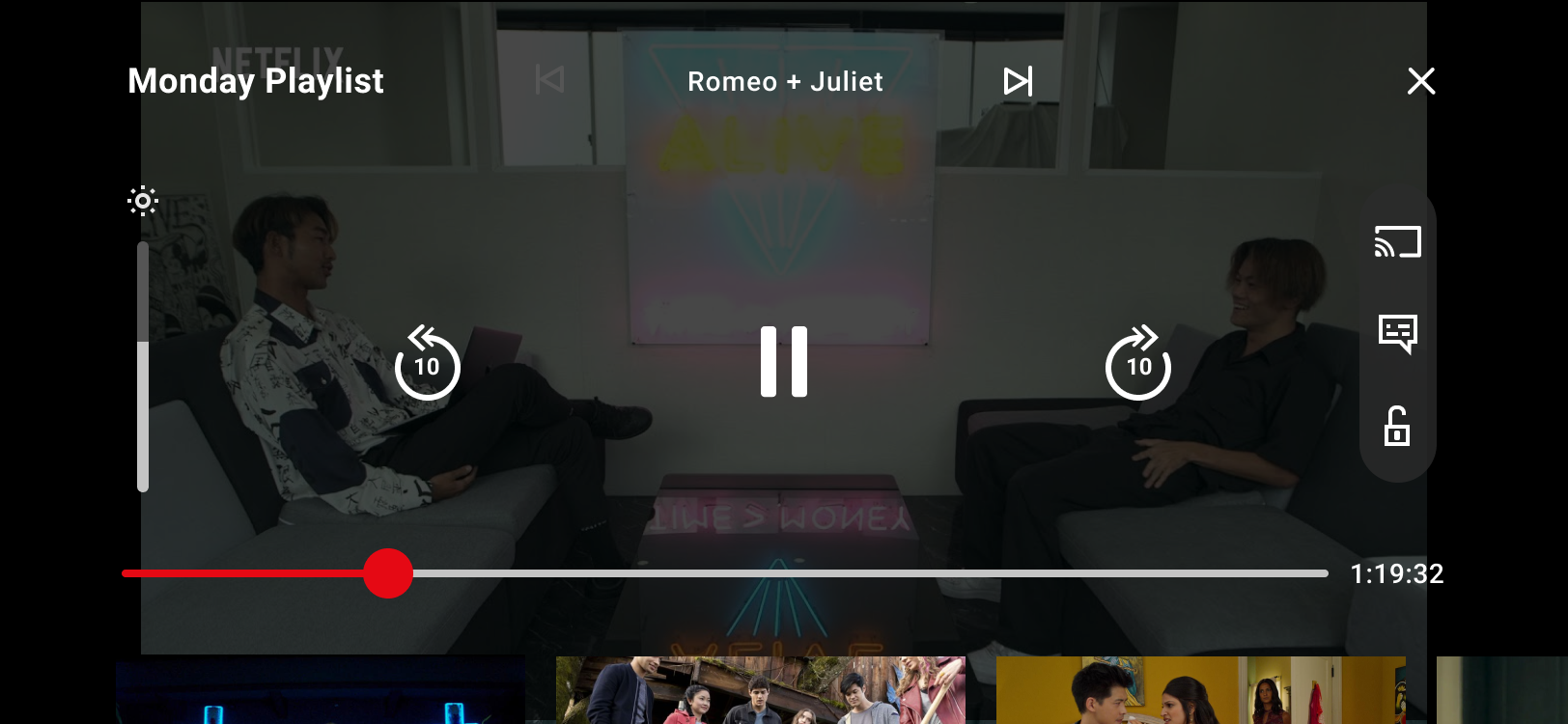
PLayback
Viewing the content through your playlist will display a different playback interface as opposed to viewing the TV Show or movie directly from their info page.
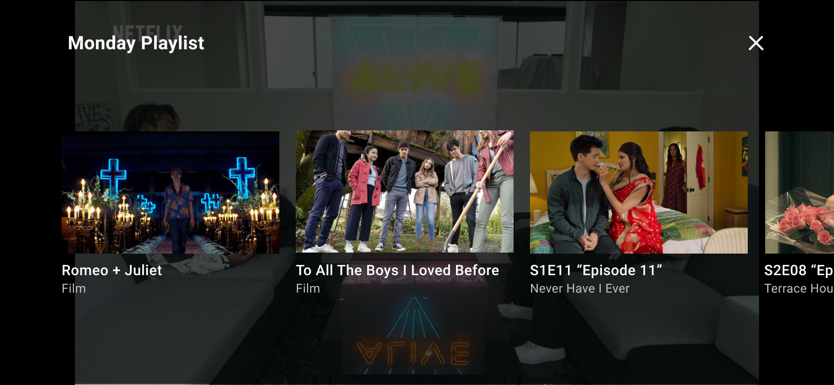
The interface will allow users to also view and select what is in their playlist. Users were happy to not have to shuffle back and forth to the playlist to select which episode or movie to wathc.

Users will also be able to access the actions displayed on the normal interface, such as screen lock, and audio and subtitles.
Visual Design
Netflix already has a color palette that has been set and stoned and has already proven to be engraved in the mind of its subscribers. While honoring the original colors, I went with the decision to modernize the typography to clean up the UI a bit.

Final Thoughts On All That Has Been Done
Seeking to simplify the Netflix usability resulted in solving 3 occurring design problems: giving users the ability to organize their desired streams into personalized playlists, promote subscriber accountability for watching content, and repurposing My Lists. After further testing, my designs have the potential to improve conversion rate and collect more user satisfaction. I hope that one day, Netflix will strive to make their product more community driven.