

OVERVIEW
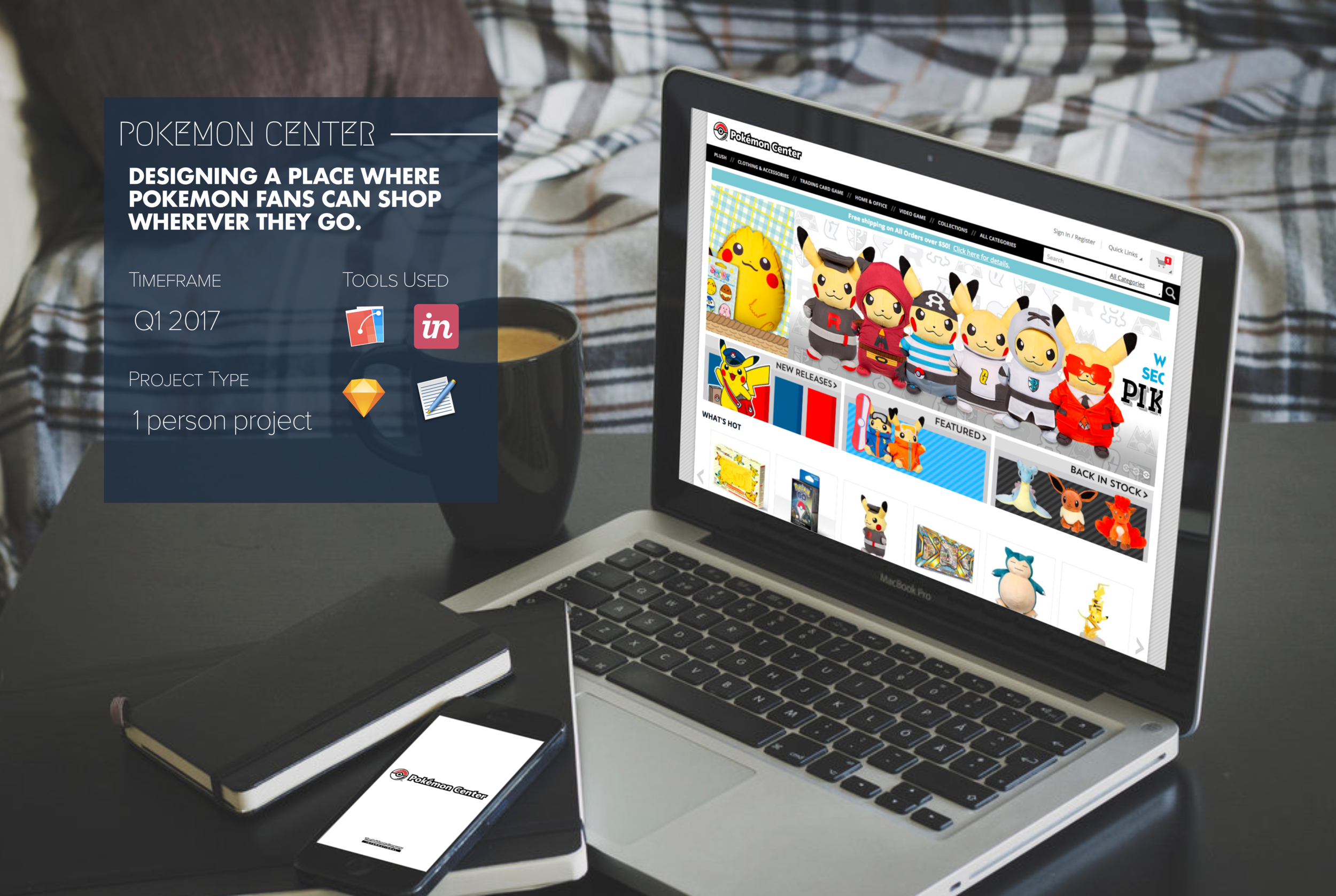
Challenge
To create an app for the Pokemon Center online store that will give users a chance to shop with ease on-the-go, while expanding the company’s consumer percentage.
PROJECT TYPE
1-person project
DURATION
2.5 weeks
TOOLS
- Paper
- Pen
- Invision
- Sketch
MY ROLE
USER RESEARCH
Went to local hobby shops and video game stores and performed contextual inquiry with those who not only are fans of the Pokemon video games, but also those who are fans of the various aspects of the franchise and who have experience shopping the Pokemon Center stores physically and online, while conducting user interviews and surveys.
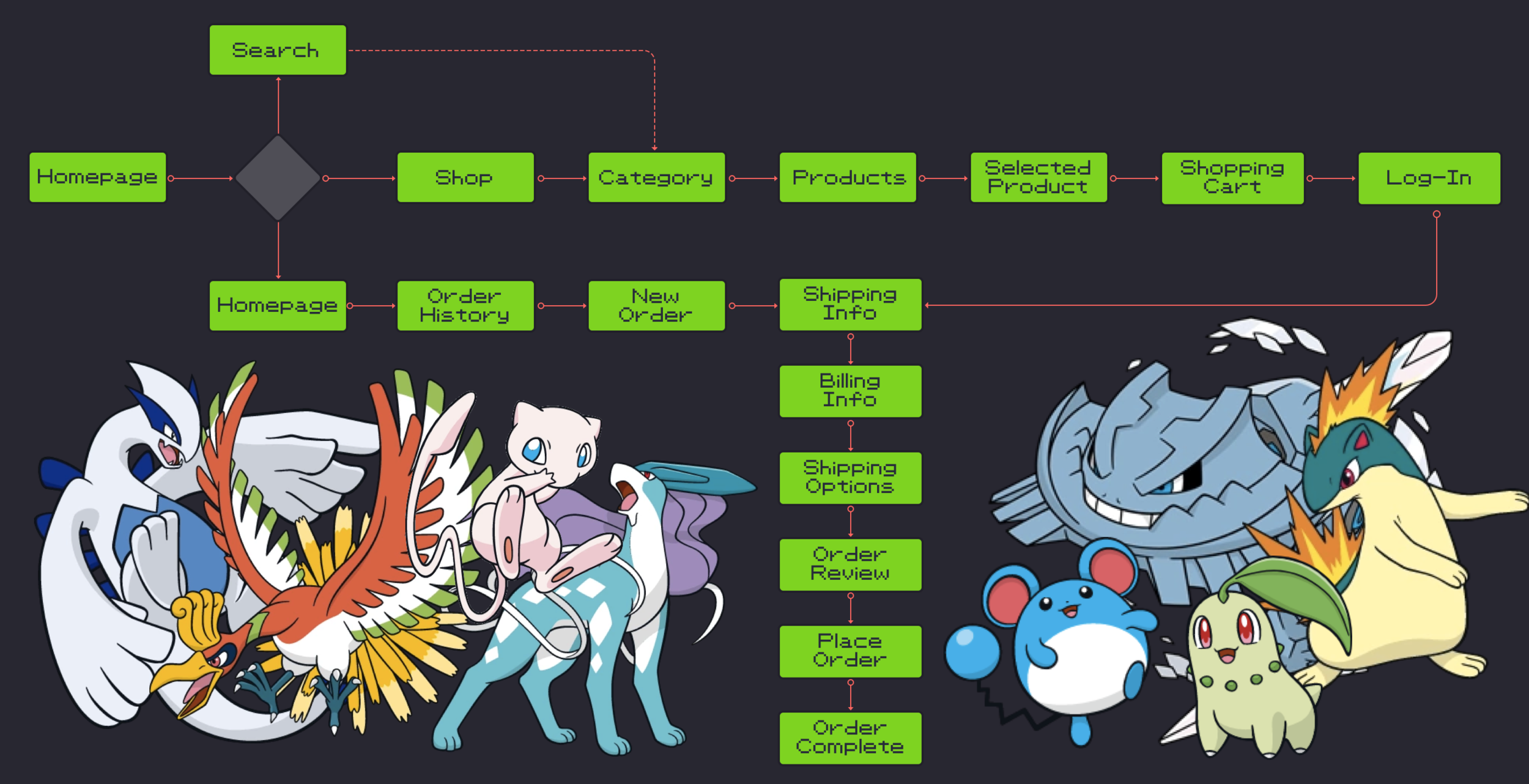
EXPERIENCE STRATEGY
Once getting the gist of how the target user groups approach the Pokemon franchise as consumers and what exactly they look into when they shop, I took the time to synthesize both qualitative and quantitative research, by means of information architecture, into site maps and user flows.
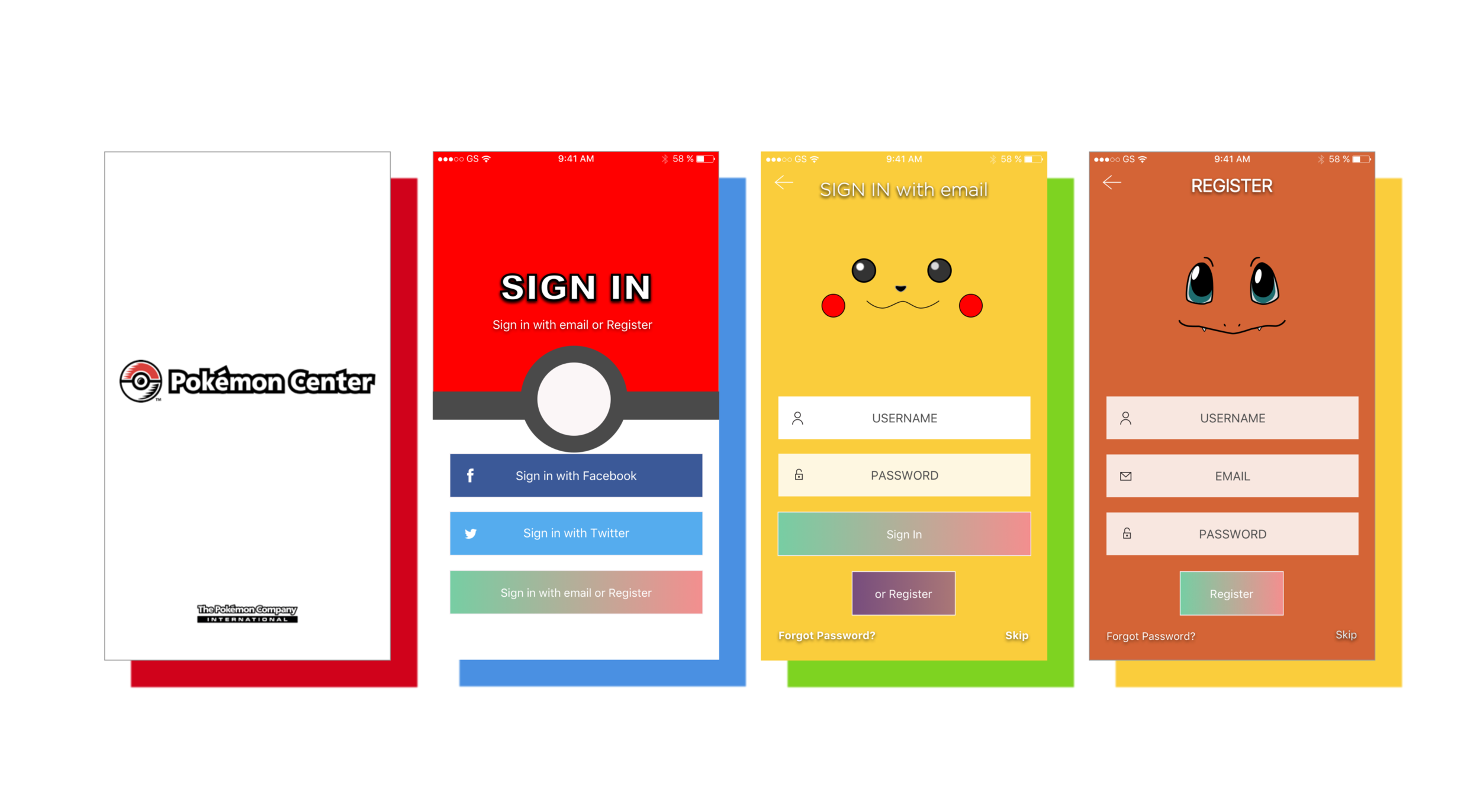
INTERFACE DESIGN
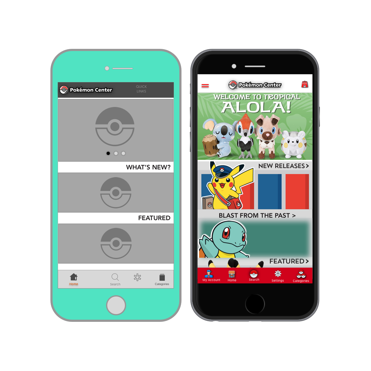
After constructing paper prototypes derived from my research, I went through several rounds of iterations leading that led to creating mid-fidelity wireframes on Sketch. Once created and ready to user test, each wireframe was then uploaded to Invision. I also had the opportunity to show users the flow of the app through a high-fidelity mockup created via Flinto.
PROBLEM
An app for the Pokemon Center Online Store is completely non-existent.
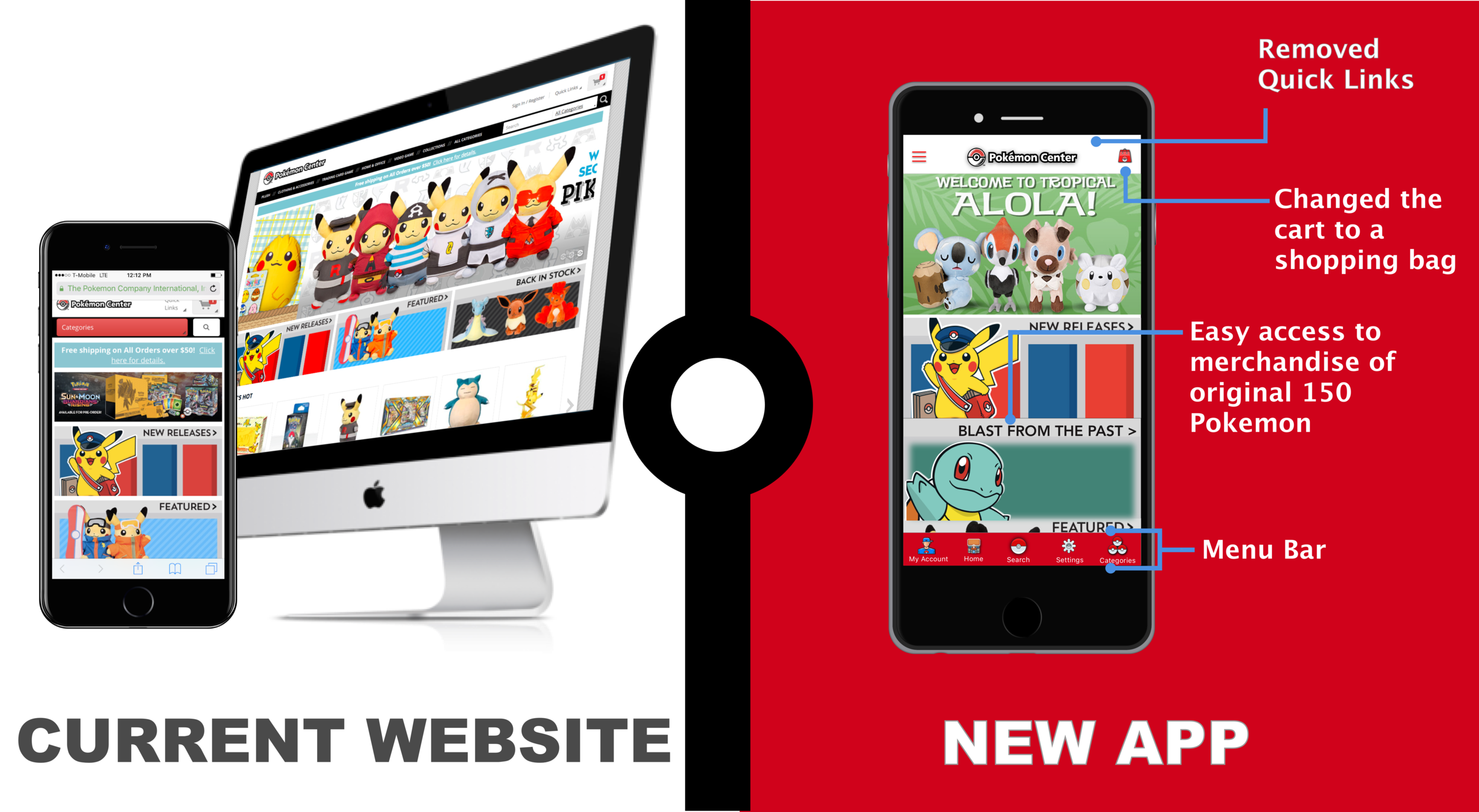
With how fast e-commerce is being revolutionized now a day through mobile apps, how does the Pokemon Center expect to maintain and improve user traffic and conversion on their website? Although the store does have a responsive mobile website that has been around for quite some time, creating an app could potentially be the next step of growth.
THE SOLUTION
To see how the typical consumer of the Pokemon Center interact with the shopping experience from the start to finish, whether it be online or the physical stores located all over Japan.
With the target users/consumers already being known, this is also the perfect opportunity to see what improvements to the website we could possibly make, or incorporate those potential elements exclusively to the app to make the mobile experience enjoyable on parallel level while creating a unique perspective while on-the-go.
THE FIELD OF MY RESEARCH
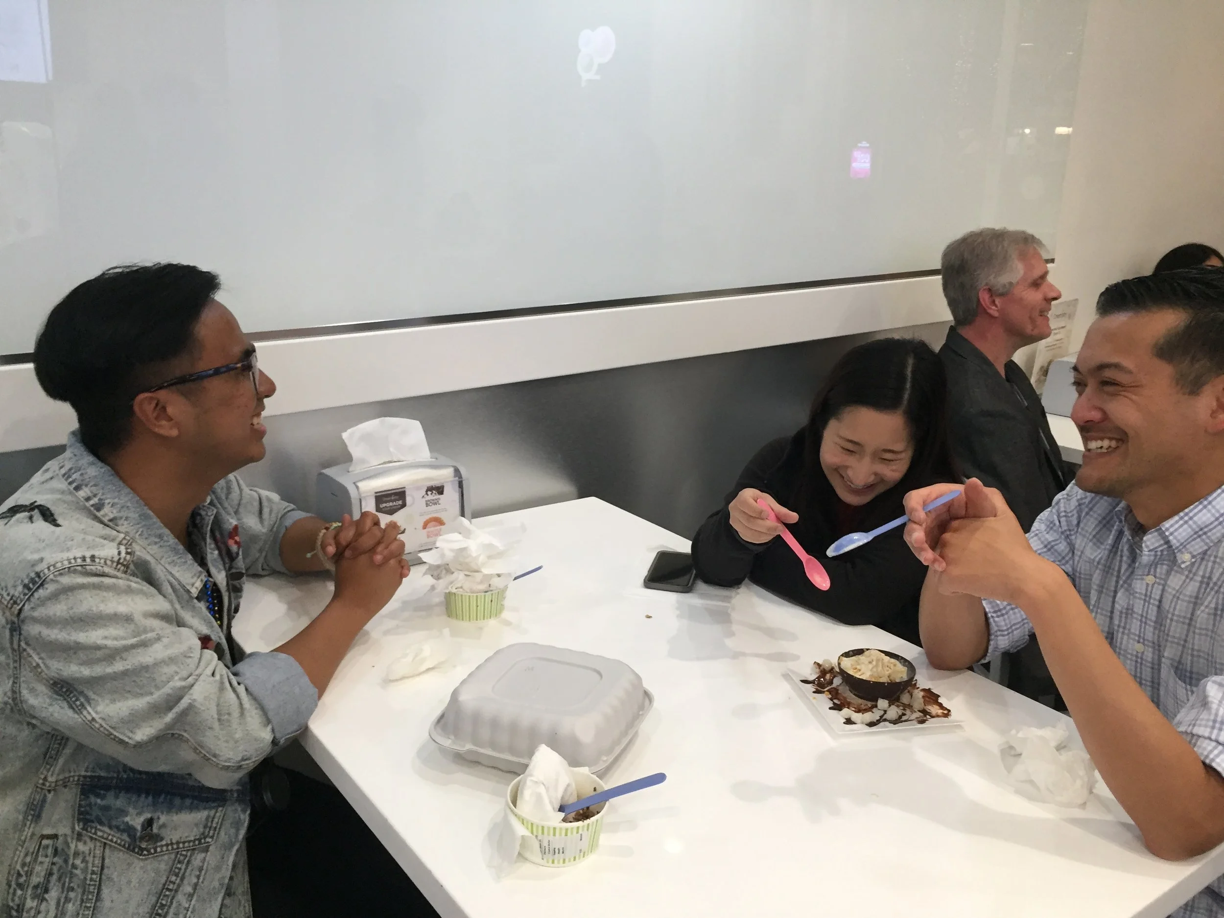
Two Pokemon Go players fresh from a trip to Japan
Pokemon fans are literally everywhere. We all remember the Pokemon Go epidemic that not only took the US and Japan by storm, but every single country in the world. Due to the fact that there are no Pokemon Center stores here in the Bay Area, I had to do a little digging elsewhere. As a consumer of the franchise myself, I happen to know that typical fans flock to video game stores, such as GameStop. It was a given that I would interview customers in store.
To widen my audience a bit, I had to take it to the next level by finding fans elsewhere. Instead of wasting my time standing in the middle of Downtown San Francisco waiting for someone with Pokemon Accessories to walk by, I decided to use Pokemon Go as a tool to find Pokemon fans. To make my presentation more approachable, I offered to buy who ever took the time to speak with me something sweet to snack on, or a cup of coffee.
CREATING A FLOW FOR USERS
USABILITY TEST FINDINGS
Onboarding
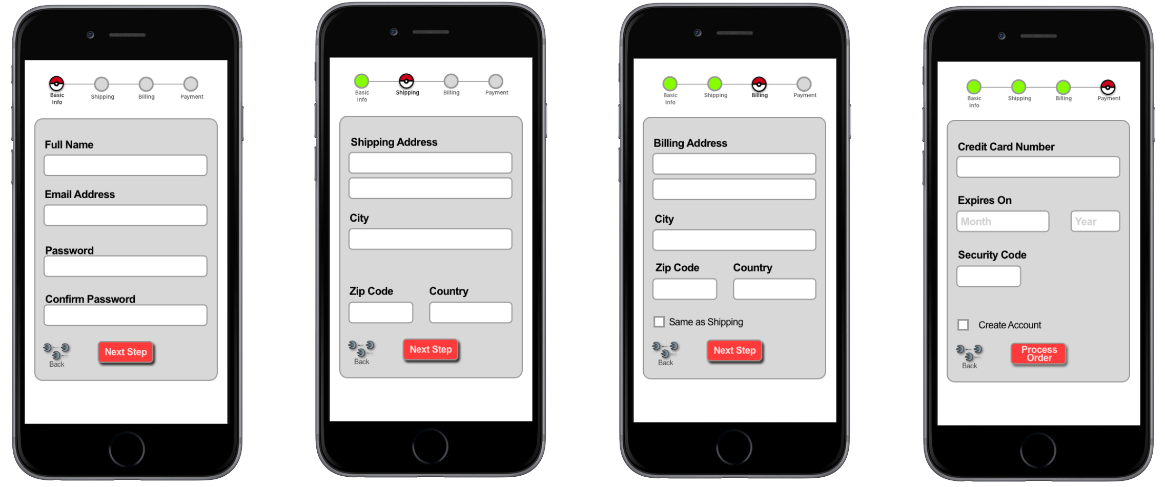
During the usability test, it appeared that users typically bypass the onboarding process and neglect adding payment information until checkout time. In terms of mobile usability, filling out the information needed while purchasing apparently made users dread the length it adds to the check out process.
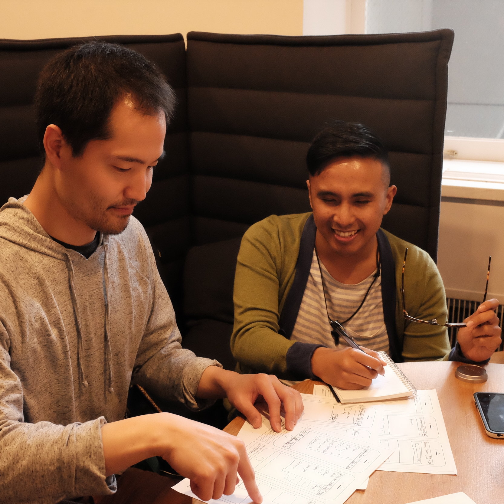
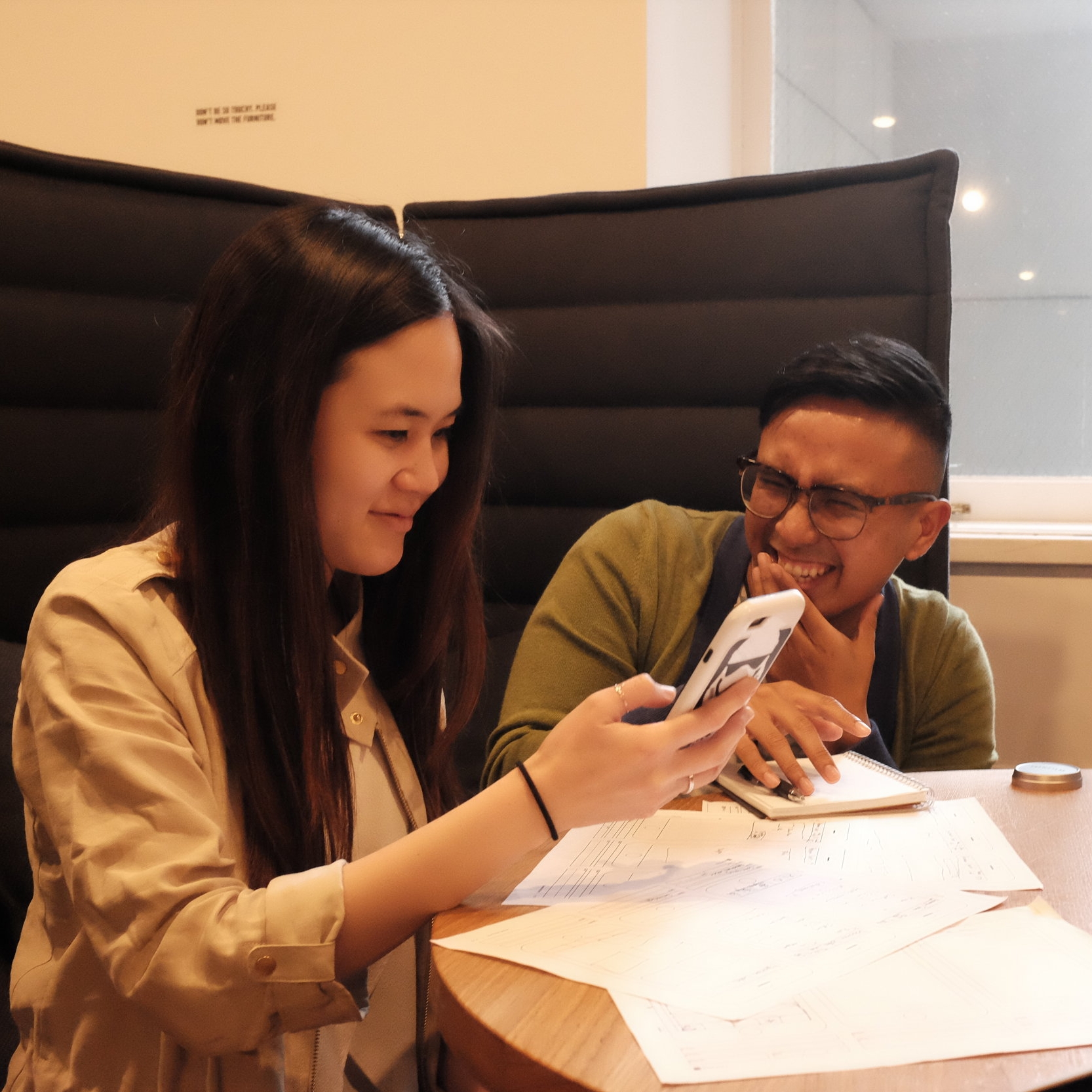
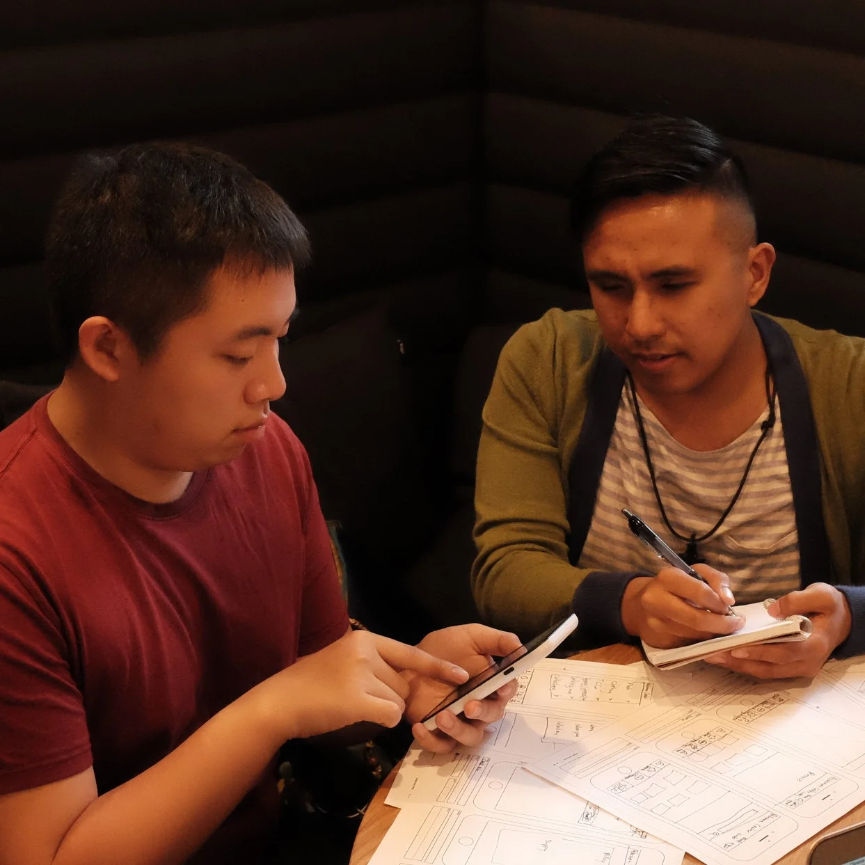
The prototypes
Three rounds of prototypes helped with finding out which features on the apps worked well or not, and gave insight on how each of the users were comfortable using everything from onboarding, to the point of check out. Starting with paper prototypes, the lowest possible fidelity, allowed us to draw out our ideas, followed by quick iterations into both mid and high fidelity prototypes. After designing a new prototype, I conducted usability testing on 5 users and made iterations derived from the research accumulated. At the end of the 2 week sprint, multiple versions of each flow process were created.
What the users were saying

New Pokemon Center App Exclusives
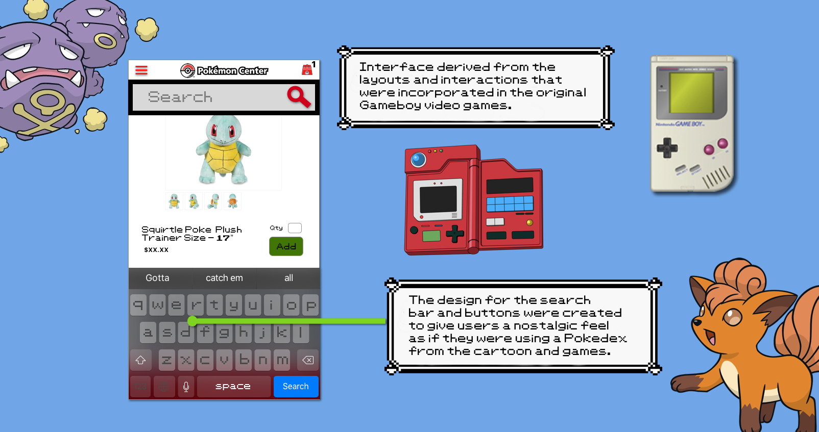
One hundred percent of the users that were interviewed have been Pokemon fans since the mid 90s. Throughout the user interviews, 10/10 of the users were asked what specifically keeps them attached to franchise after 20 years. All of them stated that as long as the original 150 characters were still present, then the nostalgia will keep the loyalty alive. When asked which aspects of the franchise tie all the way back to their childhood, each either stated the video games or the animated series are what made Pokemon unforgettable. That alone was enough validation that the mobile app for the Pokemon Center store had to have elements that will spark those memories in each of the users.
The Checkout Process
What's Next?

Nostalgia was truly the #1 keyword taken away from my research. Pokemon's audience will always associate the video games with the franchise, and are what keep the fans coming back for more. Incorporating mini games exclusive to the app will definitely make the shopping experience a lot more fun on mobile devices.

The moment a mobile app goes live for the Pokemon Center is the best way to receive feedback on a global scale, opening almost endless possibilities for iterations, which isn't a bad thing at all. If there's no room for improvement or growth, then there's no time or room left for the product to exist in the market.

As the franchise has grown and continues to grow larger, the design of the Pokemon Center App are endless. As we try to lure in new consumers using designs of the original Pokemon, there leaves an opportunity to slowly introduce the new characters to those who don't know through our visuals.